A MuseWave Digital Long-Form Story by Melissa Weisenburg
(Inspired by real waiting rooms, real first impressions, and the real stakes of digital credibility.)
There are some things you notice without trying.
Last Thursday morning, I found myself in two different waiting rooms within the span of three hours — one at a medical office, one at a financial advisor’s office — and the contrast stopped me cold.
The first had magazines from 2018, torn edges, a coffee station with empty sugar packets scattered across the counter, and a TV playing daytime reruns with the volume just slightly too loud. I sat there, scrolling my phone, counting the minutes, wondering quietly whether the care I’d receive would match the neglect in that room.
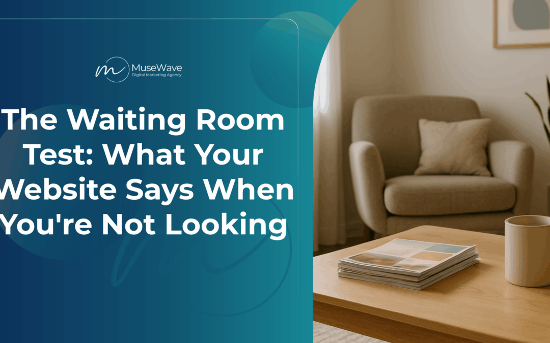
The second? A basket of current publications, soft lighting, a clean coffee bar with real ceramic mugs, and a thoughtful quote on the wall about stewardship and care. I exhaled. I trusted them before they even called my name.
And right there — between the stale magazines and the fresh coffee — a thought landed:
“Your website is your digital waiting room. And people are deciding whether to trust you before you ever say a word.”
So today, I want to talk about the Waiting Room Test, credibility signals, and what your website is quietly communicating to potential clients while you’re not looking.
Because sometimes, the most important conversation your business has with a customer is the one that happens in silence.
The Moment Before the Meeting
Picture this:
It’s 9:47 a.m. on a Tuesday.
A small business owner in Arcade, here in Western New York — let’s call him Mark — just got off the phone with a potential client who said, “I’ll check out your website and get back to you.”
Mark feels good. The conversation went well. His services are solid. His prices are fair. His reputation in the community speaks for itself.
What Mark doesn’t know is that his potential client just opened his website on her phone.
And within 8 seconds — the average time it takes for someone to decide whether to stay or leave a website — she’s made up her mind.
Not because of what Mark said.
Not because of what his business does.
But because of what his website silently communicated in those first few seconds.
The homepage loaded slowly.
The logo looked pixelated.
The contact information was buried three clicks deep.
There was no clear call to action.
The testimonials were undated — from 2016.
The “About Us” page felt generic, like it could describe anyone.
She closed the tab.
Mark never got the call back.
And he has no idea why.
Why First Impressions Happen Before the First Word
Here’s the hard truth that most business owners don’t want to hear:
Your website is being judged the moment it loads — and the verdict comes fast.
Studies have shown it takes less than a second to form a first impression of your website—and around 94% of that impression is driven by design.
Not your services.
Not your expertise.
Your design.
Your website is the digital equivalent of walking into someone’s office.
If it looks outdated, cluttered, or unclear, visitors assume your business operates the same way.
If it’s professional, clean, and welcoming, they assume you are too.
It’s not fair. It’s not always accurate.
But it’s human nature.
And in rural Western New York — where word-of-mouth still reigns and reputation is everything — your website is either building trust or breaking it before you ever get a chance to speak.
The Credibility Signals Your Website Should Be Sending
So what does a “good waiting room” website actually look like?
It’s not about being flashy or trendy.
It’s not about having the fanciest design or the longest homepage.
It’s about signaling trust through clarity, professionalism, and intentional design.
Here are the credibility signals that matter most:
1. Fast Load Time
What It Says: “I respect your time.”
If your website takes more than 3 seconds to load, 53% of mobile users will abandon it. (Google)
In areas like Holland, Java Center, or Warsaw where internet speeds can be slower, this matters even more.
The Fix:
✅ Compress images
✅ Use a quality hosting provider
✅ Remove unnecessary plugins
2. Clear, Professional Design
What It Says: “I take my business seriously.”
Your website doesn’t need to be elaborate.
But it does need to be clean, modern, and easy to navigate.
If your site looks like it was built in 2005, visitors will assume your business hasn’t evolved either.
The Fix:
✅ Use a professional template or custom design
✅ Stick to 2-3 brand colors
✅ Use plenty of white space
✅ Choose readable fonts (no Comic Sans, ever)
3. Mobile Responsiveness
What It Says: “I understand how people search today.”
Over 60% of web traffic comes from mobile devices. If your site doesn’t look good on a phone, you’re invisible to most potential clients.
The Fix:
✅ Test your site on your phone regularly
✅ Use responsive design that adjusts to screen size
✅ Make buttons large enough to tap easily
4. Visible Contact Information
What It Says: “I’m easy to reach and ready to help.”
If visitors have to hunt for your phone number or email, they’ll move on.
Your contact info should be in the header, footer, and on a dedicated “Contact” page.
The Fix:
✅ Put your phone number in the header
✅ Add a contact form on every service page
✅ Include your physical address if you serve a local area
5. Social Proof
What It Says: “Other people trust me — you can too.”
Testimonials, reviews, case studies, and client logos all build credibility.
But they need to be recent and specific.
A generic testimonial from 2016 does more harm than good.
The Fix:
✅ Display 3-5 recent testimonials on your homepage
✅ Include client names and photos (with permission)
✅ Link to your Google Business Profile reviews
✅ Use specific outcomes: “Melissa helped us increase leads by 40% in 90 days.”
6. Clear Value Proposition
What It Says: “I know exactly how I can help you.”
Within 5 seconds, visitors should be able to answer:
- What does this business do?
- Who do they serve?
- Why should I trust them?
The Fix:
✅ Write a clear headline that states what you do
✅ Use a subheadline to explain who you serve
✅ Include a call to action above the fold
The Trust-Erosion Trap
The opposite of credibility isn’t just a lack of trust.
It’s active distrust.
When your website sends the wrong signals, it doesn’t just fail to build confidence — it actively erodes it.
Here are the red flags that make visitors leave:
❌ Broken links
❌ Outdated copyright dates
❌ Stock photos that look fake
❌ Grammar or spelling errors
❌ No clear way to contact you
❌ Vague, generic copy
❌ Slow load times
❌ Pop-ups that cover the entire screen
❌ Auto-playing videos with sound
Each of these is the digital equivalent of a stained carpet in a waiting room.
It tells the visitor: “This business doesn’t pay attention to details.”
And if you don’t pay attention to your website, why would they trust you to pay attention to their project?
What This Means for Small Western NY Businesses
In big cities, people might give you the benefit of the doubt.
In rural Western New York, reputation is everything — and your website is now part of that reputation.
If someone in Arcade hears about your business at a Chamber mixer and decides to look you up online, your website is either going to reinforce the trust they already feel or plant a seed of doubt.
You don’t get a second chance at that first impression.
And here’s the kicker:
Most business owners don’t even realize their website is costing them clients.
They think:
“I get most of my business through referrals anyway.”
“My website is good enough.”
“People in small towns don’t care about that stuff.”
But they do.
Because even in small towns, people Google you before they call you.
They check your reviews before they book.
They look at your website before they refer you.
They scroll your services before they trust you with their project.
And if your digital waiting room doesn’t match the quality of your work, they’ll move on quietly — without ever telling you why.
The Traditional Wisdom Still Applies
My grandparents owned a restaurant in Strykersville for years.
At one point, they made the decision to do a full remodel — not because the food needed to change, but because they understood something important:
The atmosphere tells people whether you care.
They added ceiling beams.
They filled the walls with small-town memorabilia and local antiques.
They created a space that felt cozy, welcoming, and unmistakably theirs.
It wasn’t about being fancy.
It was about showing customers: “We take pride in this place. We want you to feel at home here.”
And people responded.
Because those details — the beams, the antiques, the care in every corner — weren’t just aesthetics. They were credibility signals.
They told potential customers: “These people care about the experience we’re going to have.”
Your website is no different.
It’s your digital front door.
And every detail — from load speed to testimonial placement to the clarity of your headline — is sending a message about who you are and whether you can be trusted.
The Real Insight: It’s Not About Perfection
As I sat in that second waiting room — the one with the clean coffee bar and the thoughtful quote — I realized something important:
It wasn’t perfect.
There was a small scuff mark on the wall.
One of the chairs was slightly faded.
The plant in the corner needed watering.
But it was cared for.
And that’s what mattered.
Your website doesn’t need to be flawless.
But it does need to show that you care.
Because when someone lands on your site at 9:47 a.m. on a Tuesday, deciding whether to call you back, the question they’re asking isn’t “Is this perfect?”
The question is:
“Can I trust these people to take care of me?”
Your website needs to answer yes — clearly, confidently, and quickly.
Pearl of Wisdom
Straight from a medical office waiting room, a financial advisor’s office, and years of watching small businesses win or lose clients based on first impressions:
Your website is your digital waiting room.
And people are deciding whether to trust you before you ever say a word.
Make sure it’s saying the right things.
Ready to find out what your website is actually saying?
Get your free WAVE Visibility Audit™ and discover exactly where your website is building trust — and where a few quick fixes could turn more visitors into clients.
In just minutes, you’ll get:
- Website Strength Check – Is your site built to attract and convert?
- Trust & Conversion Score – Do visitors feel confident choosing you?
- Technical SEO Health Check – Is everything running smoothly behind the scenes?
- Actionable Priority List – Know exactly where to focus for the fastest wins
Stop guessing what your website is saying. Get your instant personalized report.
👉 Claim Your Free WAVE Visibility Audit™
Or, if you’re ready to skip the DIY and get a website that builds trust from the first click, let’s talk about our WaveMaker™ Website packages — WordPress sites built for credibility, conversions, and calm.
📞 Book Your Free Discovery Call
Because your work is too good to lose clients in the waiting room.